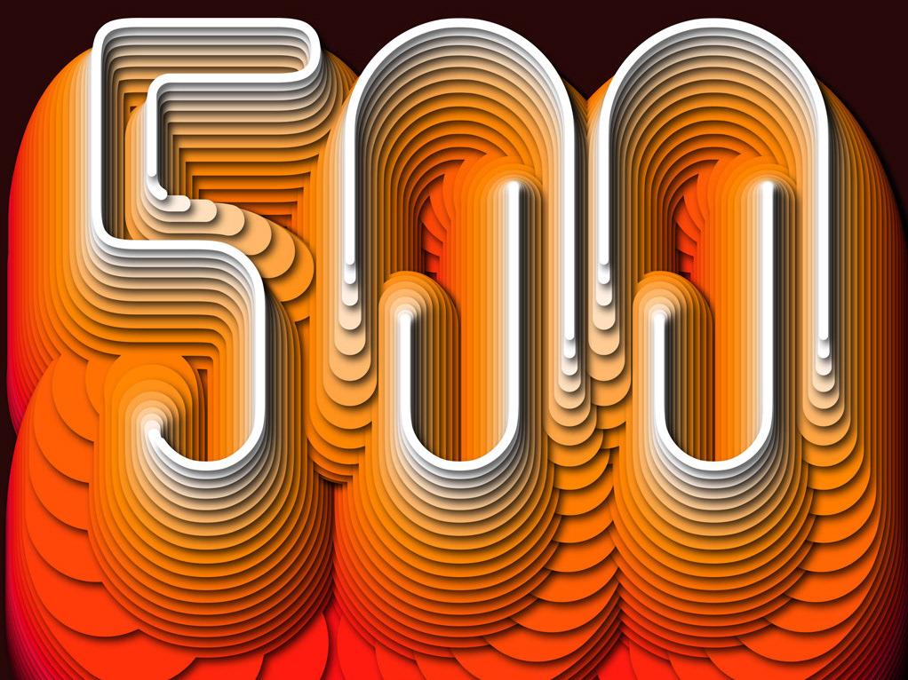
Cover Design - Fortune 500 - China
2024
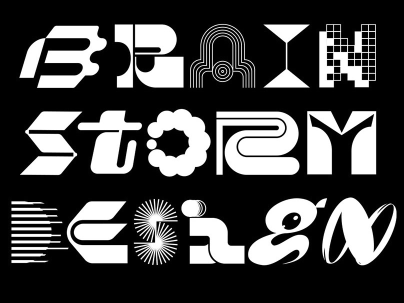
Fortune Brainstorm Design
2024
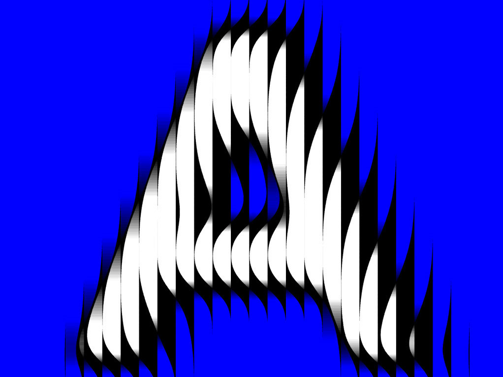
36 Days of Type 2024
2024
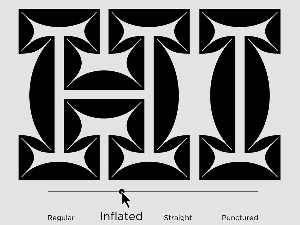
Makadam - Variable Font
2024
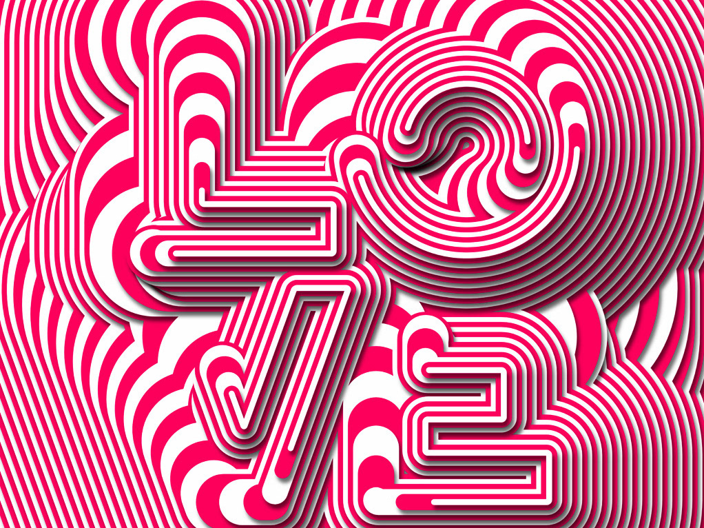
Type In Motion
Collection of procedural vector type animations made with Cavalry
2024
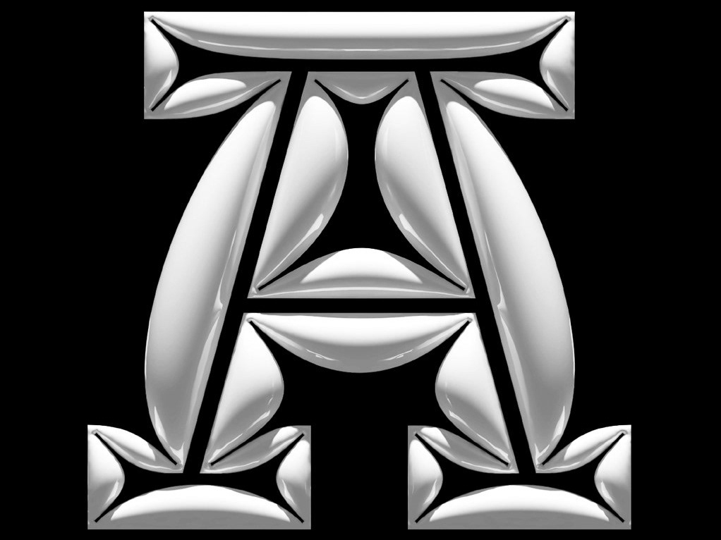
36 Days Of Type 2023
2023
HNY2023
2023 Type Experiments
2023
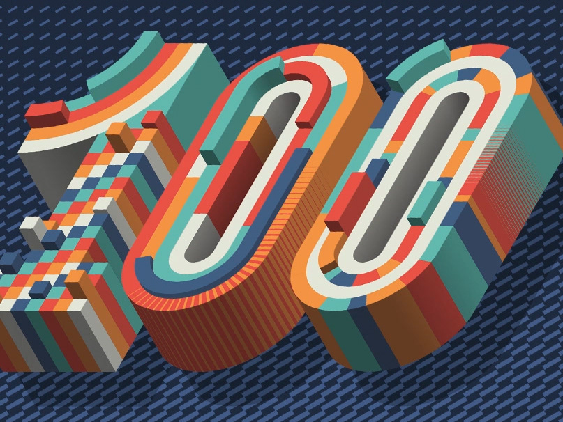
EMERCE 100
I was approached by Emerce Magazine to design a cover for their special issue of the 100 best companies in e-business.
2022
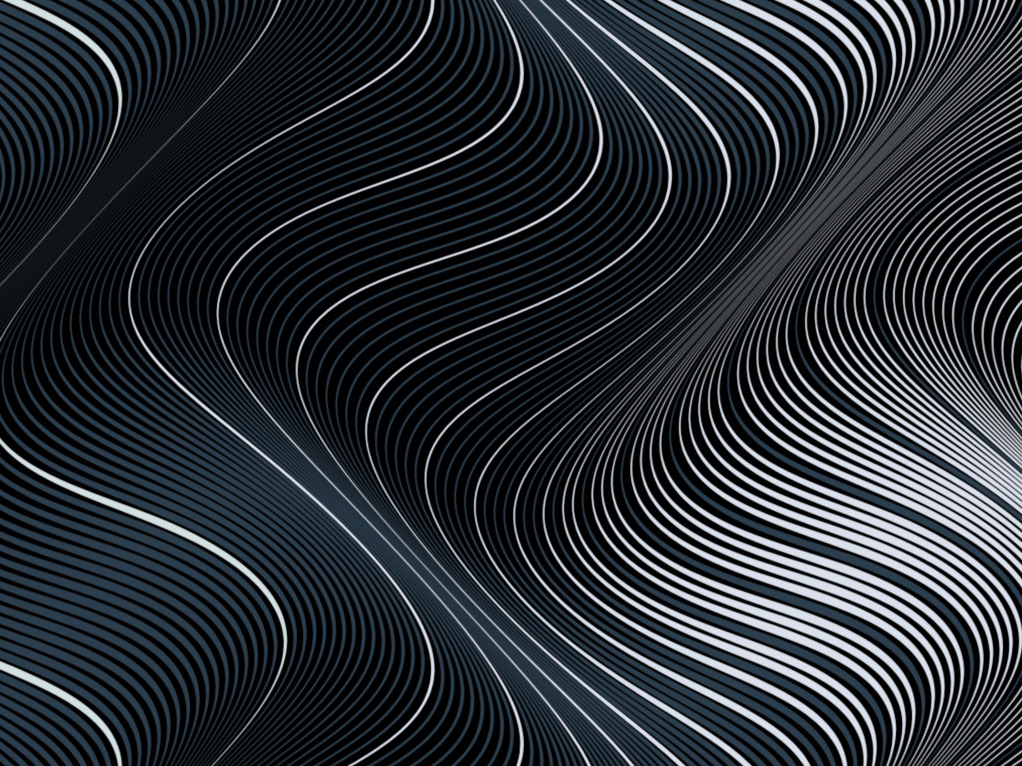
Ucon Acrobatics Motif 2.0
For their 20th anniversary, the Berlin based Ucon Acrobatics approached me to be part of the 2nd edition of Motif, a collaborative design project with 20 artists ouf of 20 countires, designing 20 unique pattern designs, limited to 20 pieces.
2021
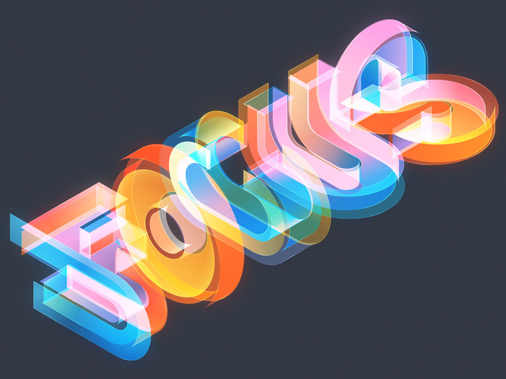
Isotype 3
Self initiated typographic series based around isometric grids
2021
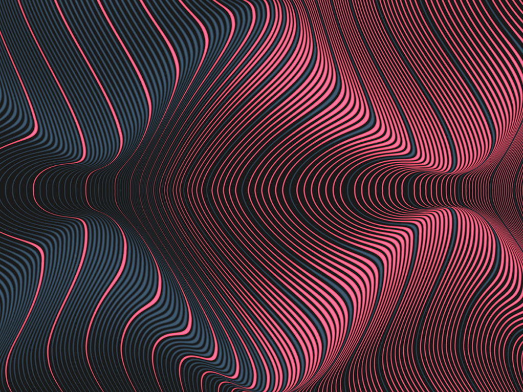
Novelty Waves 4
Part 4 in this series of self initiated abstract works
2019
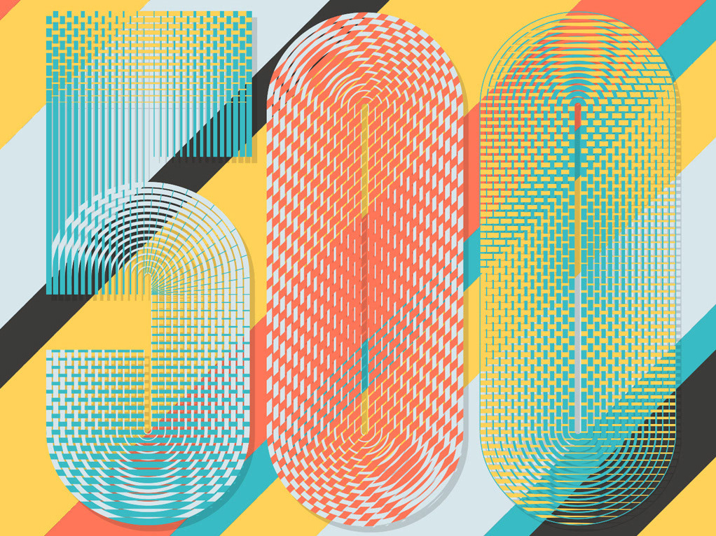
Fortune Magazine China - Top 500
Cover and inside design for Fortune Magazine China Top 500
2021
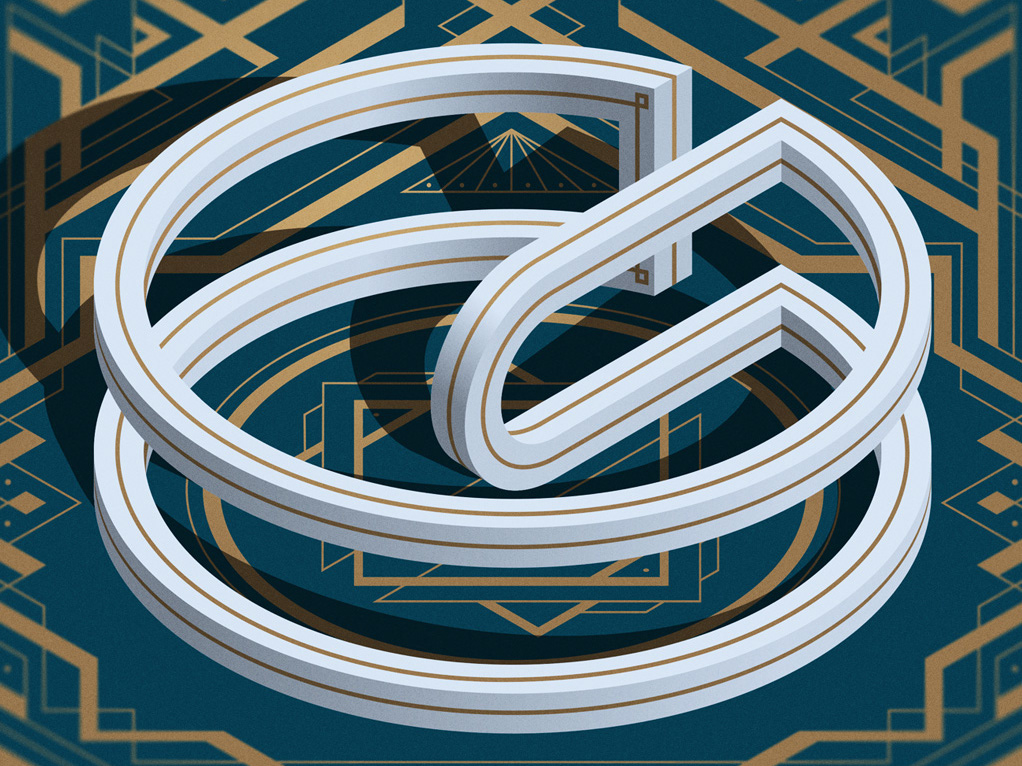
The Great Gatsby - Penguin Books - Deluxe Edition
Book design for "The Great Gatsby - Deluxe Edition" by Penguin Classics
2021
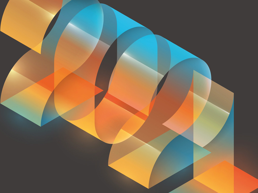
Cover Design - Private Equity News
Cover Design for Private Equity News Magazine
2021
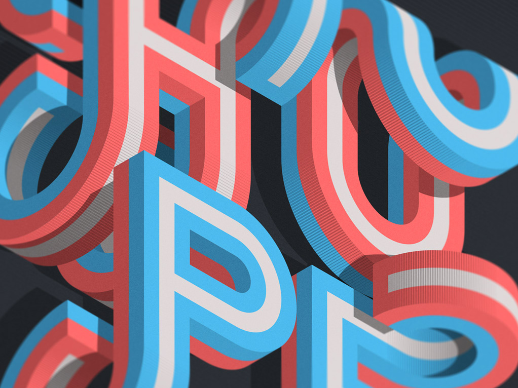
Isotype 2
Self initiated series based around isometric grids.
2020

Fortune Magazine China: Top 500
I was approached by Fortune Magazine China to design a cover for the Top 500 Chinese companies.
2020
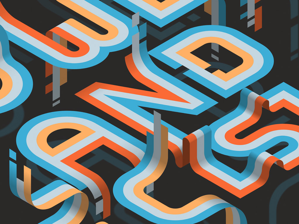
Affinity Designer: Power and Precision
I was approached by Serif to make an image for their vector software Affinity Designer.
The goal was to make an isometric typographic piece with the slogan ‘Power and Precision’.
Client: Serif Company
Typography / Art Direction: Mario De Meyer
2020

World Economic Forum - Geopolitical Report
I was approached by the World Economic Forum to design the cover artwork and campaign assets for a Geopolitical Report that helps mark the 50th anniversary of the organisation.
2020
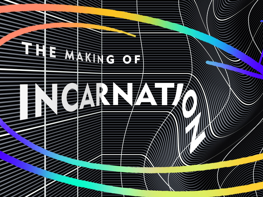
The Making Of Incarnation / book cover
Book cover design for Tom McCarthy's "The Making of Incarnation"
2021
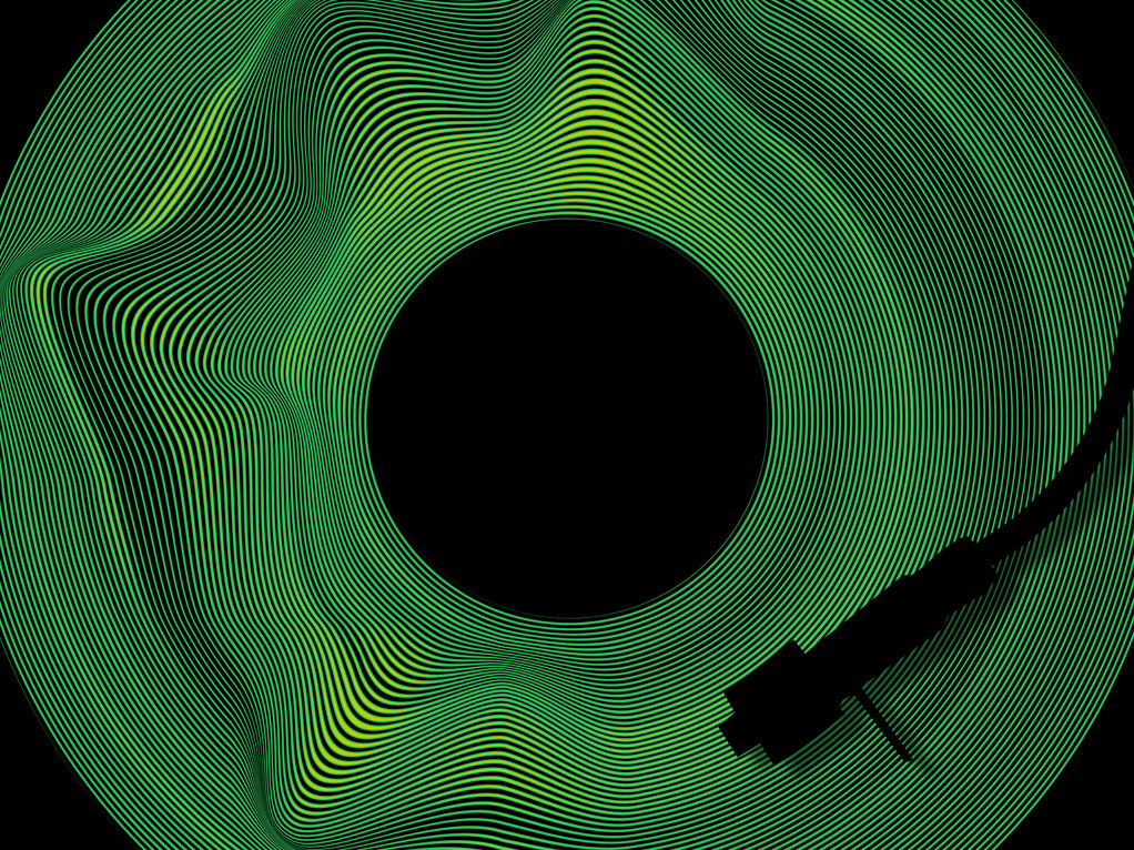
Fortune Magazine - Autumn 2019
Collections of works done for Fortune Magazine / Autumn 2019
2019

Handelsblatt / Watches Special
I was approached by Handelsblatt / Germany to design a series of typographic images for a special about luxury watches.
The special is about the “A-to-Z of watches” and consists of several words related to time and an alphabet.
2019
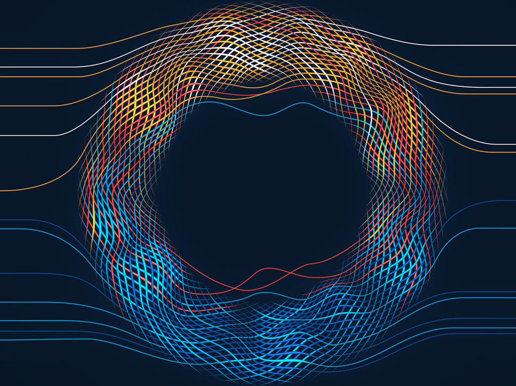
New Scientist: Space-Time
I was approached by NewScientist to design a cover for an issue about the true origins of space-time.
The goal was to have an image that has a feeling of something being created and weaved togheter.
2019
Novelty Waves 3
Series of personal abstract works, the result of many late night experiments
2016
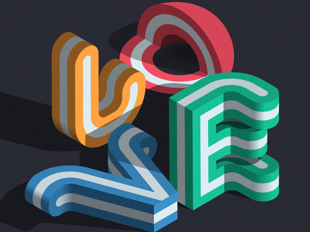
ISOTYPE
Self iniated typographic series based around isometric grids
2019
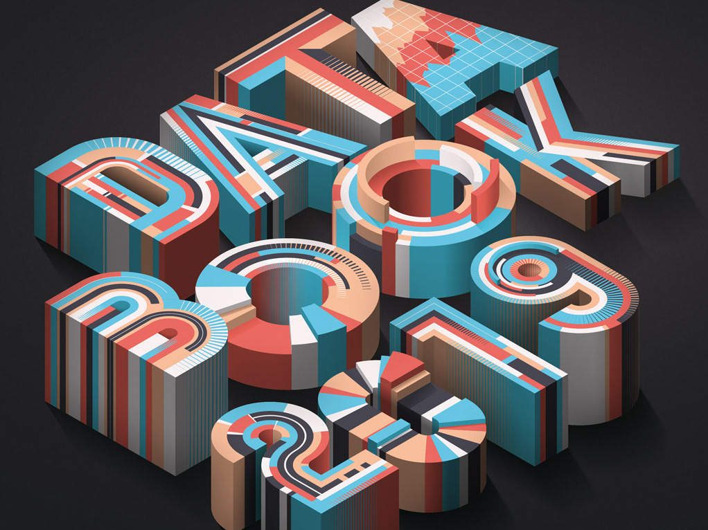
TRD - Data Book 2019
I was approached by The Real Deal magazine to design a cover for The Data Book 2019.
This is a book of real estate statistics and facts, covering data points through 2018.
2019
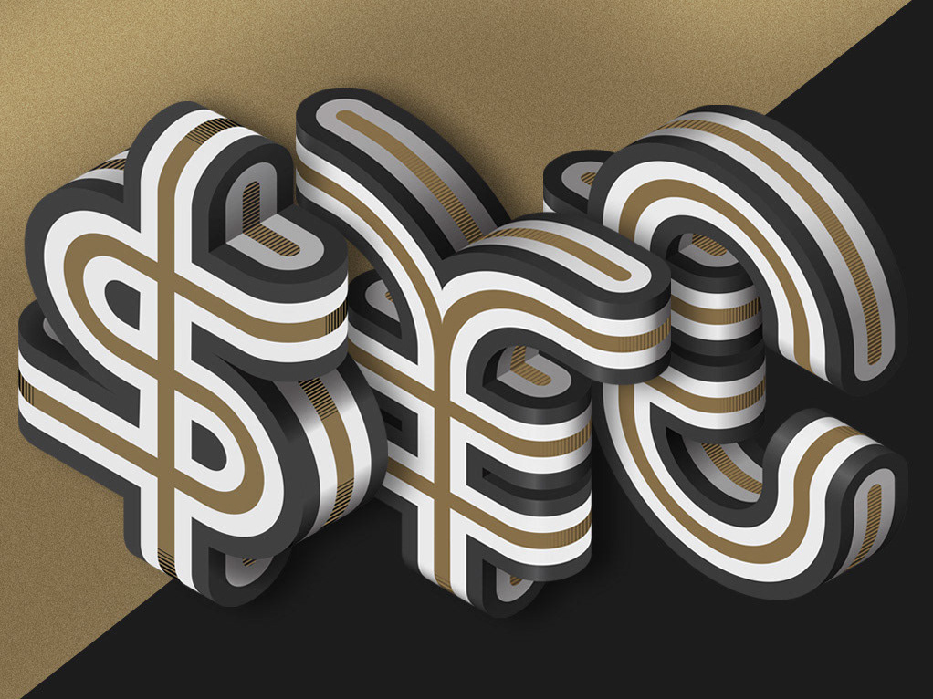
Fortune Magazine - Investor's Guide 2019
I was approached by Fortune magazine to design a cover for the Investor’s Guide 2019. The US edition was printed in Pantone gold, the same concept was used for the European and Asian editions.
2019
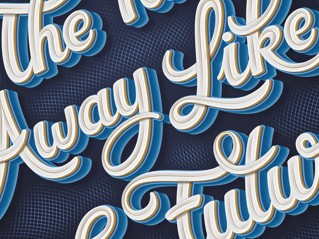
Goodtype Book Volume 2
Goodtype The Book Volume 2, is a 288 page curation of beautiful and eclectic letterforms from designers around the world.
The collection encompasses a multitude of lettering styles from hand lettering, to computer generated 3D-type, to hand painted murals, to traditional calligraphy.
This is my contribution to the book.
2018
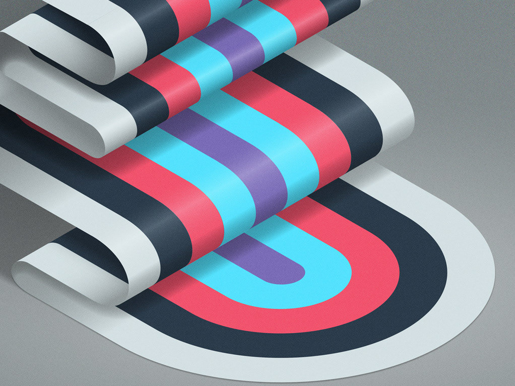
36 Days of Type 2018
36 days of type is a project by Rafa Goicoechea & Nina Sans that invites designers, illustrators and graphic artists to give their particular view on the signs from our alphabet.
36 days of restless creativity, in which participants are challenged to design a letter or number for each day, resulting in an overall view of the ability to represent the same sign from many different perspectives.
This is my contribution to the project.
2018
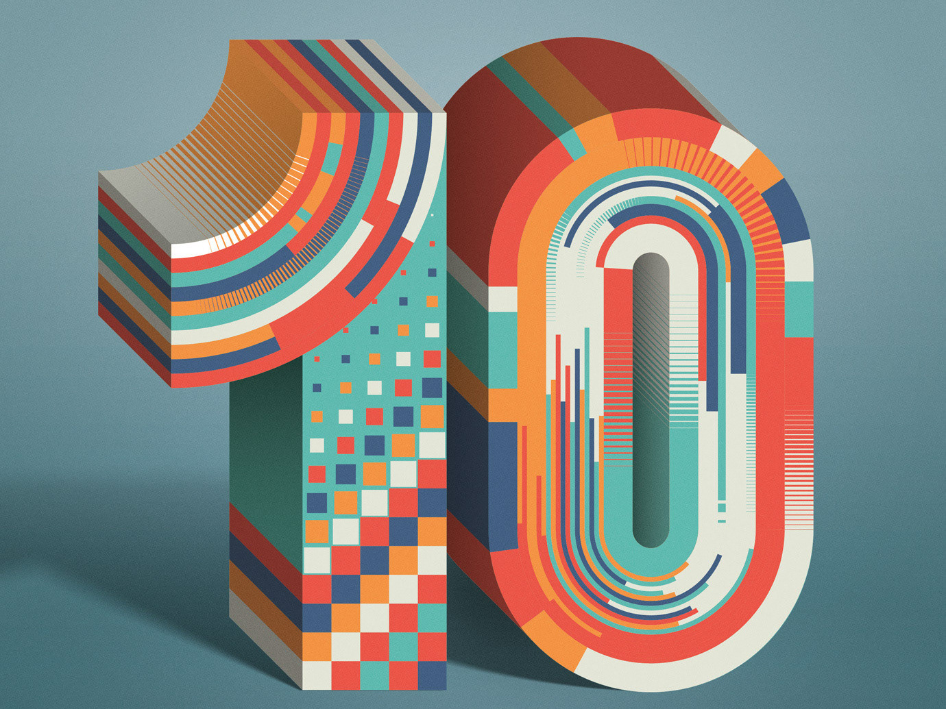
OBRAS Magazine
Cover design commissioned by Obras magazine
The issue is a special about the 10 best architectiual smart firms.
Client: Obras magazine
Art director: Cynthia Monterossa
Illustration / Typography: Mario De Meyer
2018

New Scientist - The Shape of Numbers
I was commissioned by New Scientist magazine to design an illustration for the article “The Shape
of numbers’ about the relationship between arithmetic and geometry (numbers vs. shapes)
2018

IEEE Spectrum - Top Tech 2018
I was approached by IEEE Spectrum to design typography for the January ‘Top Tech 2018’ issue.
The project consists of a cover image and a second image for the features opener.
2018
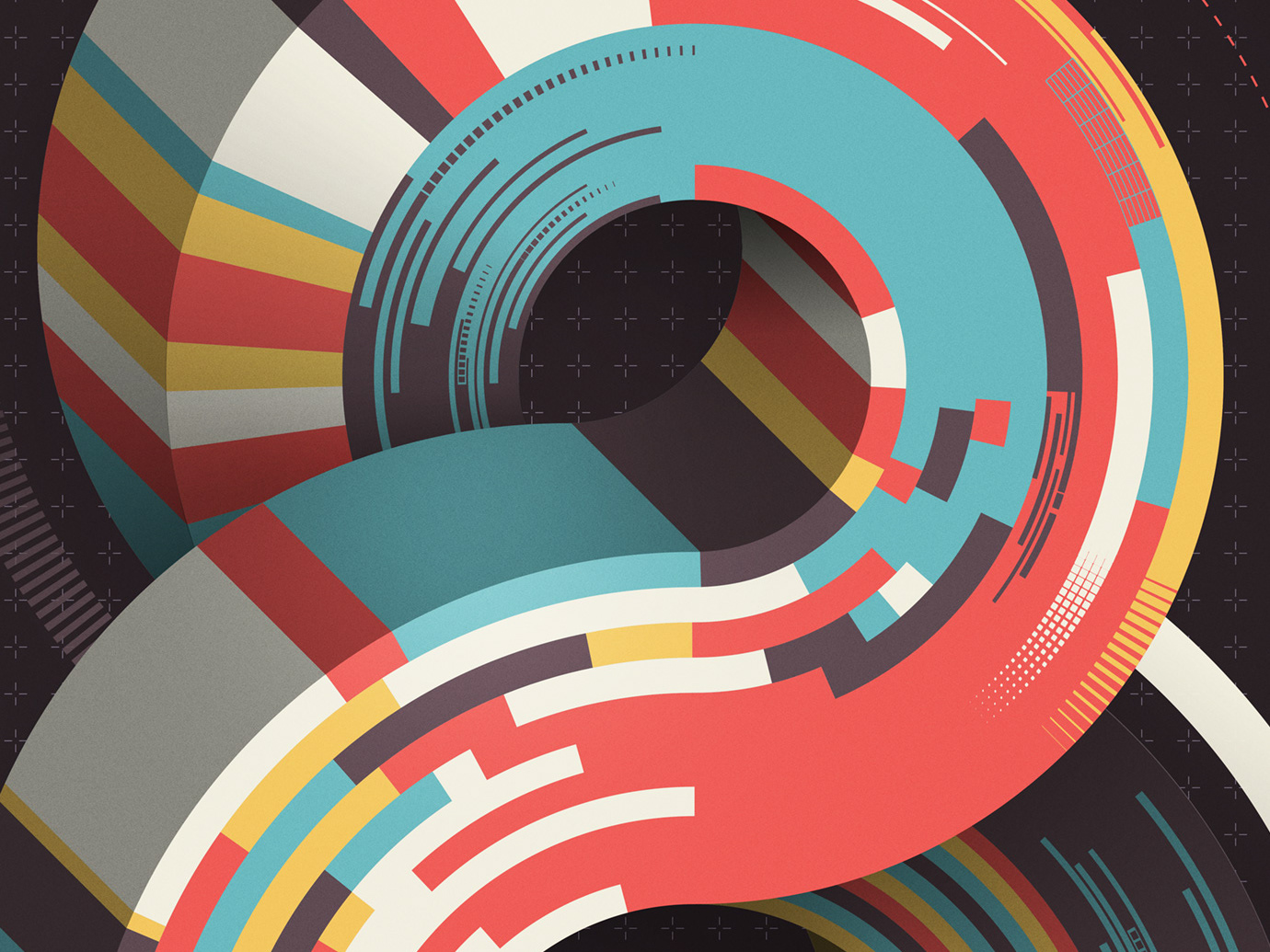
Adobe Animate CC 2018 - Official Splash Screen
Adobe Animate CC 2018 - Official Splash Screen
2017
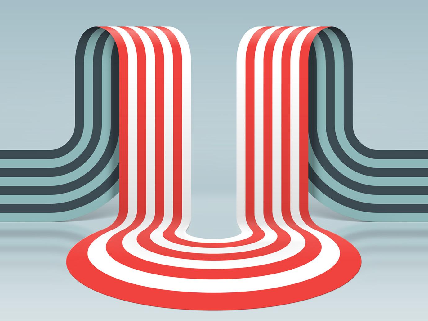
36 Days Of Type 2017
36 days of type is a project by Rafa Goicoechea & Nina Sans that invites designers, illustrators and graphic artists to give their particular view on the signs from our alphabet.
36 days of restless creativity, in which participants are challenged to design a letter or number for each day, resulting in an overall view of the ability to represent the same sign from many different perspectives.
This is my contribution to the project.
2017
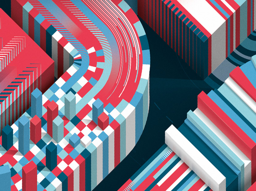
Seneca Red - 50 Years
Seneca college is celebrating 50 years, I was commissioned to illustrate the cover and features opener for their Seneca RED magazine.
As the celebration is not only a look in the past, but also in the future, we decided to illustrate a classic golden “50” for the cover and a technical looking “5.0” for the features opener representing data, information and the future.
2017
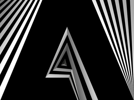
Adobe - Experience - Cannes Lions
I was commissioned by Adobe to make a visual for the 'Experience' seminar at the Cannes Lions Festival 2016.
'Experience' is a seminar which will explore how risk-taking, fighting against industry norms and breaking out of silos are critical to delivering breakthrough experiences. Equally, it will discuss what new types of content, design and experiences are shaping our future and culture, as well as how agencies can adapt to this approach and partner better with clients to create impact.
Speakers:
Stefan Sagmeister - Designer, Co-founder - Sagmeister & Walsh
Billie Whitehouse - CEO - Wearable Experiments
John Travis - Vice President, Brand Marketing - Adobe
Art Direction: Kashka Pregowska-Czerw
Typography: Mario De Meyer
Client: Adobe
2016
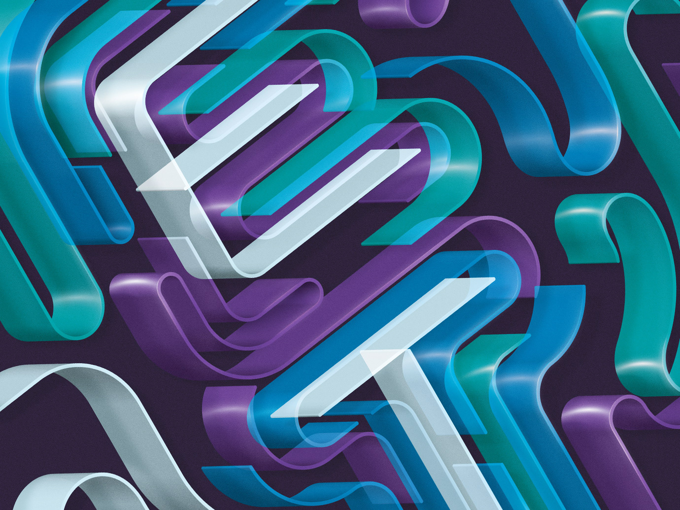
Barron's Magazine - ETF
Barron's Magazine / ETF
I was approached by Barron’s magazine / Dow Jones to design typograpy
for an article about Electric Trade Funds.
Client: Barron’s magazine / Dow Jones
Art Director: Robert Connolly
Typography: Mario De Meyer
2018
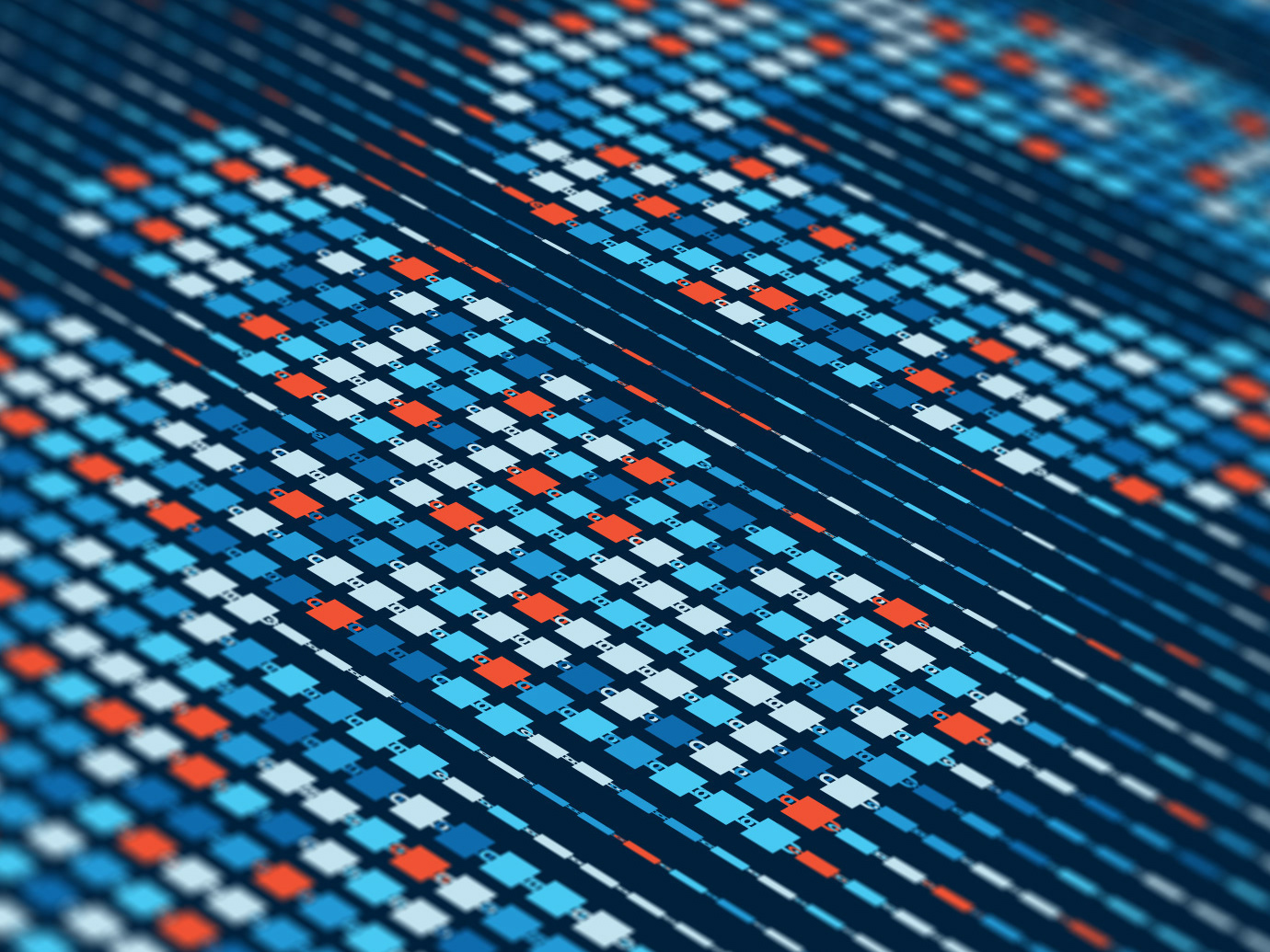
IEEE Spectrum - Blockchain Special
I was approached by IEEE Spectrum to design typography and illustrations for their special ‘Blockchain World’ issue.
I’ve tried to conceptualize what a blockchain actually is by using cascading, interlinking chains of blocks to evoke the technology’s ingenuity and complexity.
The project consists of a cover image, TOC image, several spreads and some full pages.
2017
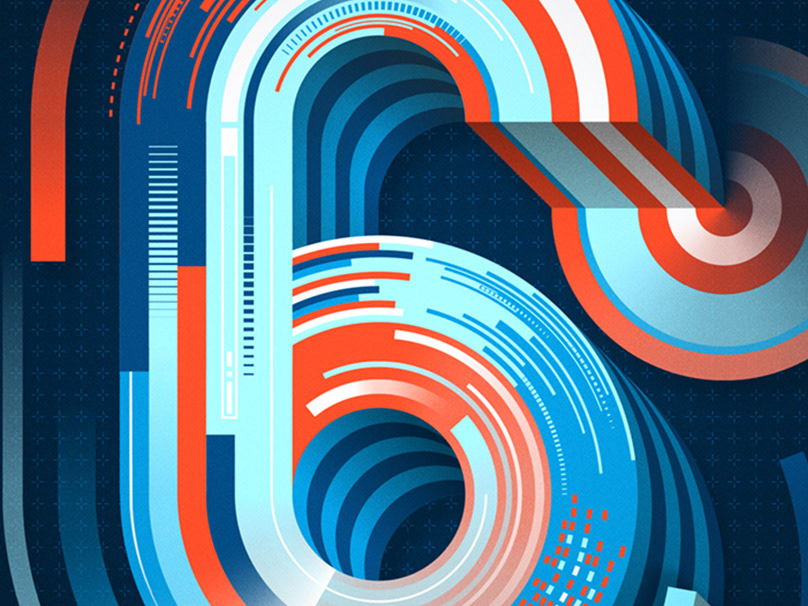
36 Days Of Type 2016
36 Days of Type is a project by Rafa Goicoechea and Nina Sans that invites designers, illustrators and graphic artists to give their particular view on the signs from our alphabet. 36 days of restless creativity, in which participants are challenged to design a letter or number for each day, resulting in an overall view of the ability to represent the same sign from many different perspectives. A project that aims to create a space for creation around typography and its endless graphic possibilities.
This is my contribution to the project
2016
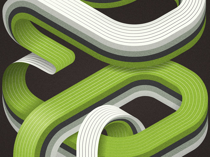
Show Us Your Type - SEOUL posters
Show us your type: SEOUL presents the latest installment of a global typography initiative where cities and typo meet. It’s a project set up with an aim to provide a platform for artists and designers to share their talents and explore the world from a different perspective using creative typography. This is my contribution for ShowUsYourType - SEOUL
2017
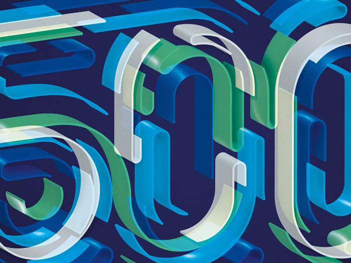
Entrepreneur - Franchise 500
Entrepreneur Magazine approached me to design 2 typographic images for their "Francise 500" issue.
Client: Entrepreneur Magazine
Art Director: Evelyn Good
Typography: Mario De Meyer
2017
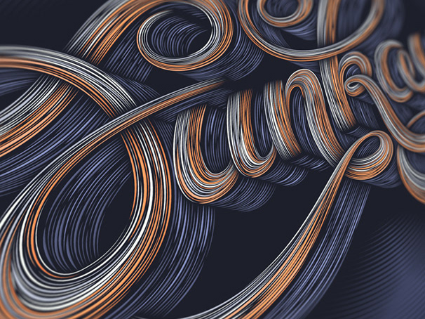
Goodtype Book Volume One - Funkay
Goodtype The Book Volume One, is a 288 page curation of beautiful and eclectic letterforms from 175 artists and designers around the world.
The Collection encompasses a multitude of lettering styles from hand lettering, to computer generated 3D-type, to hand painted murals, to traditional calligraphy.
This is my contribution to the book.
2016
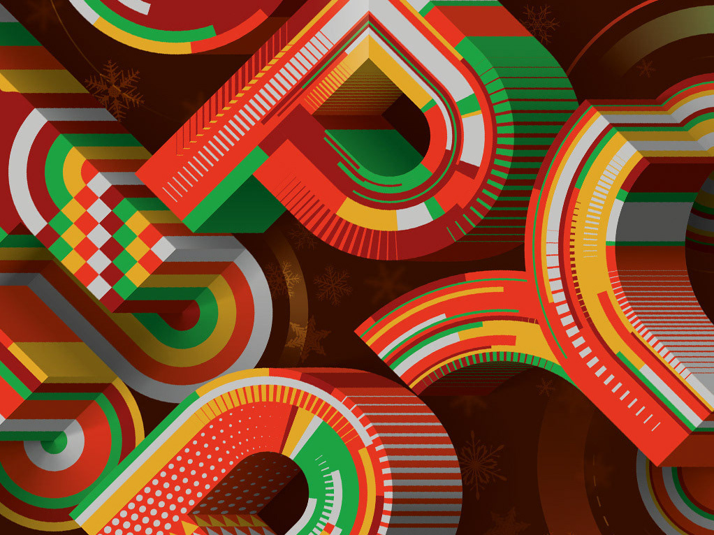
Hoppy Art Land Poster
I was approached by Hoppy Beverages Japan to design a winter/christmas-themed poster for the Hoppy Art Land poster series.
2018
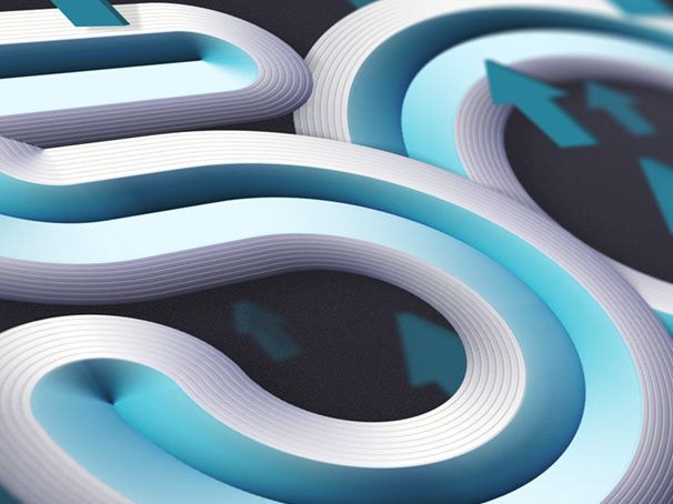
Inc. 500 Magazine
I was commissioned by Inc. to design a cover, a custom font and several spreads for their 'America's 500 Fastest Growing Private Companies' issue.
Client: Inc. Magazine
Art Director: Blake Taylor
Typography: Mario De Meyer
2016

Show Us Your Type - Berlin revisited 2016 posters
Show Us Your Type: Berlin revisited 2016 presents the latest instalment of a global typography initiative where cities and typo meet. It's a project set up with the aim to provide a platform for artists and designers to share their talents and explore the world from a different perspective using creative typography. This is my contribution for 'Berlin revisited 2016'
2016
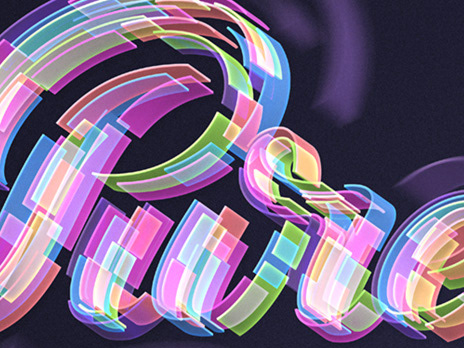
Pure New Pleasure Seeker
Self initiated typographic project inspired by the Moloko song 'Pure Pleasure Seeker'.
2016
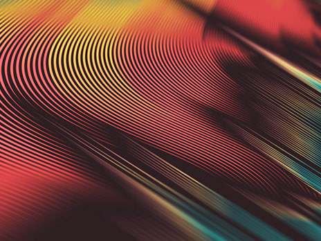
Fortune Magazine - Good Stocks For Bad Times
I was commissioned by Time Inc. to make an Illustration for the "Good Stocks For Bad Times' article. This is my interpretation of hot stocks during turbulent times.
Art Director: Michael Solita
Illustration: Mario De Meyer
Client: Time Inc. / Fortune
2016
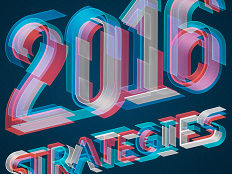
Bloomberg Markets Magazine
Commission for a full page type project for Bloomberg Markets Magazine.
Art Direction: Siung Tjia
Typography: Mario De Meyer
Client: Bloomberg
2016
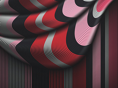
Novelty Waves 2
Novelty Waves 2
Series of abstract works. The result of many late night experiments.
2015
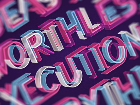
AIGA Quotes
I was invited by AIGA (The American Institute of Graphic Arts) to make 5 design quotes that revolves around creativity.
2015
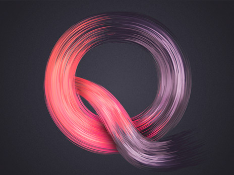
36 Days Of Type 2015
36 Days of Type is a project that invites designers, illustrators and graphic artists to give their particular view on the signs from our alphabet.
36 days of restless creativity, in which participants are challenged to design a letter or number for each day, resulting in an overall view of the ability to represent the same sign from many different perspectives.
A project that aims to create a space for creation around typography and its endless graphic possibilities.
This is my contribution to the project
2015
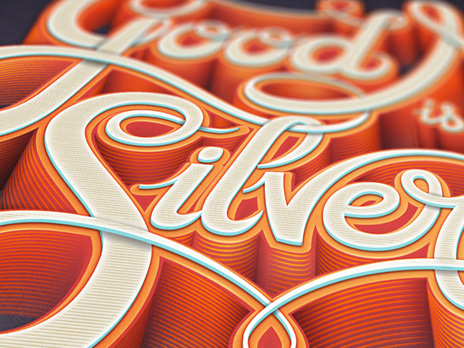
Good Name Is Better Than Silver & Gold
"Good Name Is Better Than Silver & Gold" is a self initiated typographic project inspired by the fantastic William Onyeabor.
2015

Novelty Waves + Adobe Prelude CC Splash Screen
series of personal abstract works.
One of the works was used as a splash screen for Adobe Prelude CC2015
2014
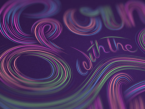
Going With The Flow
Part 2 in an ongoing typographic series based around songtexts
(model 500 - The Flow)
2014
